Status over Time#
With this graphical cockpit widget, you can visualize the development of your project over time. The change in the number of items per status can be a good indication of how close you are to project completion and can provide you with information about the workload to be managed.
Configuration#
This widget must be configured before it can be used.
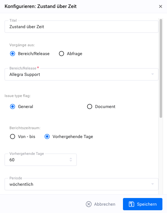
You have a number of display options. First, you should give your widget a meaningful name so that you know what you are actually seeing in the widget later.
Then you need to determine the projects or releases you want to monitor. You can select an entire project that includes all associated project releases, or just some releases.
Next, select the reporting period you want to monitor. You can either set a fixed interval that starts and ends on a specific date, or, more sensibly, just look at the last X days.
Next, you need to set the granularity of your widget, for example to daily, weekly or monthly. The granularity determines the time interval used for the calculation of the associated values. If the granularity is “weekly”, a reporting interval goes from the beginning of one week to the end.
In the next step, you need to select the type of algorithm you want to use for the calculation of the values to be displayed. Four different algorithms are available:
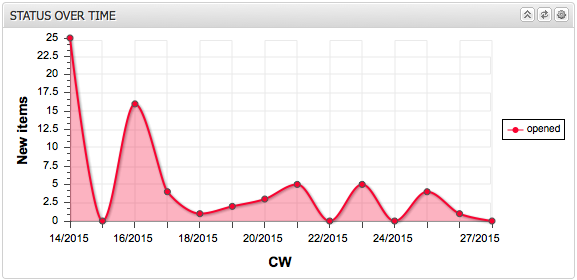
New items in interval: This chart shows the number of newly created items per reporting interval (day, week, month).
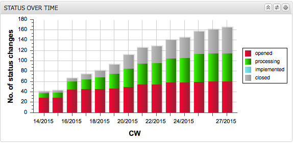
Cumulative Activity: This chart shows the cumulative number of items that have changed to the selected status in each selected interval. For example, if the granularity is set to “monthly” and the status to “implemented”, the chart would show for each month how many items have switched to the “implemented” status in that month and in all previous months up to the start of the reporting period.
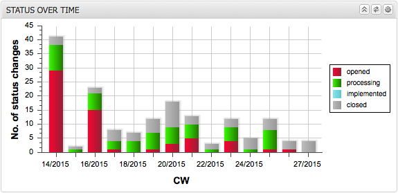
Interval Activity: This chart shows the number of items that have changed to the selected status within the selected interval. For example, if the reporting interval is set to “monthly” and the status to “implemented”, the chart would show for each month how many items have switched to the “implemented” status.
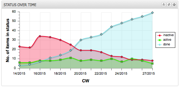
Number of items in interval: This chart shows the number of items that are in the selected status at the end of each reporting interval (day, week, month). For example, if the reporting interval is set to “weekly” and the status to “closed”, the chart would show for each end of a week how many items were in the “closed” status at that time.
In the last step, you can adjust the item statuses to be considered. In the case of “New Items in Interval”, the status is irrelevant as only the creation date is considered.
You can group statuses into categories and only display the categories. You can use either a stacked bar chart or a line chart. Optionally, you can fill the area below the lines.
The following figures show some example views.