

Board#
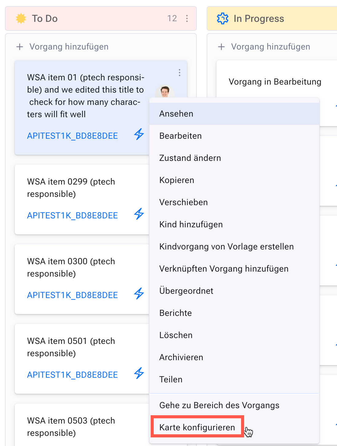
With the board or agile board, you arrange your items on small cards in columns on a virtual board. Each column represents an item state, or whatever you like.
By moving a card to a new column, you assign the associated value to the corresponding item attribute, for example a new state or a new responsible.
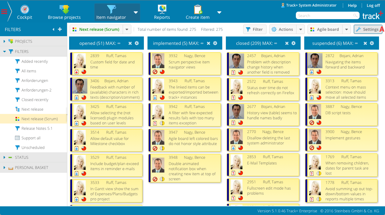
Board view overview#
Choosing columns#
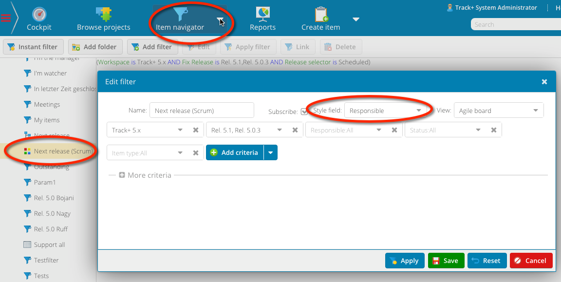
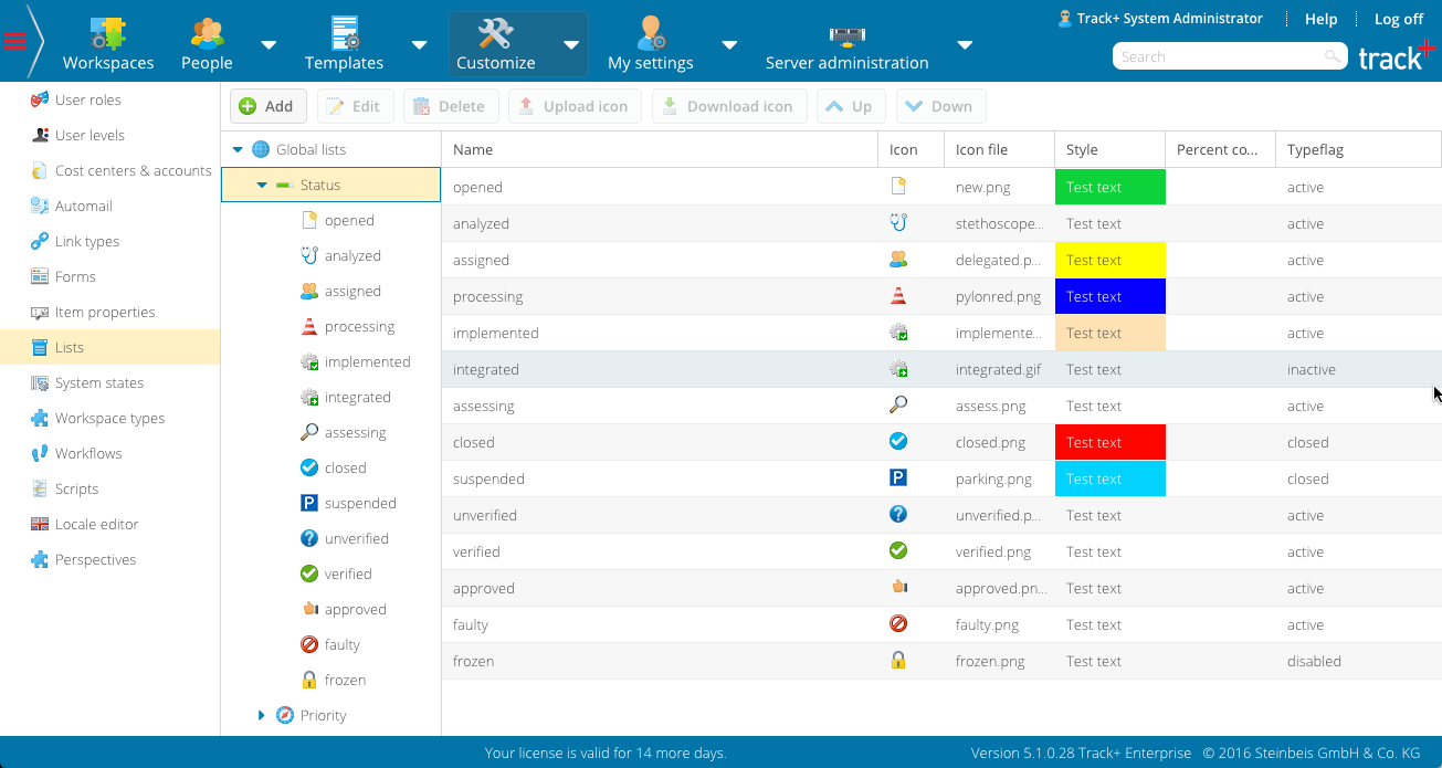
Cards on the board are organized in rows and columns. You can choose which item attribute is used for the columns. Only attributes that are based on selection lists can be used for this, such as state, responsible, manager or priority.
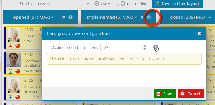
Click the
Settingsbutton (A) to display the agile card configuration area.Select the desired column property.
Click the
Settingsbutton (A) again to hide the configuration area.
Choosing columns#
Within each column, you can define the sort order for the cards based on the item attributes.
Moving columns and items#
You can remove column values from the agile card to limit the number of columns shown.
Moving columns and items#
To remove a column, click the small “remove” icon on the right side of the column header. Note: you cannot remove columns if at least one item with a corresponding property value exists.
Limiting the number of entries per column#
You can remove column values from the agile card to limit the number of columns shown.
Limiting the number of entries per column#
To remove a column, click the small “remove” icon on the right side of the column header. Note: you cannot remove columns if at least one item with a corresponding property value exists.
Setting column colors#
You can remove column values from the agile card to limit the number of columns shown.
Setting column colors#
To remove a column, click the small “remove” icon on the right side of the column header. Note: you cannot remove columns if at least one item with a corresponding property value exists.
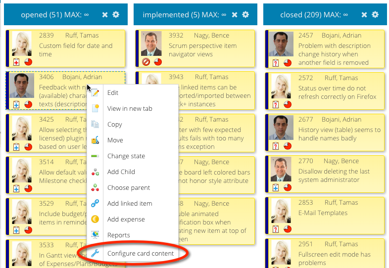
Configuring cards#
You can remove column values from the agile card to limit the number of columns shown.
Configuring cards#
To remove a column, click the small “remove” icon on the right side of the column header. Note: you cannot remove columns if at least one item with a corresponding property value exists.