

The item browser#
The item browser shows you the items you want from the overall set and lets you work with them. Alongside the cockpit, it is the most important view for everyday work.
The item browser consists of two main areas:
navigation area
item area
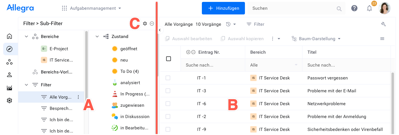
The navigation area on the left (A) lets you choose the filter that determines which items appear in the item area. Click the icon at the top right of the filter area (C), and the subfilter menu opens. With a subfilter, you narrow down the result set of the main filter further.
When you drag items from the item area onto a node in the subfilter or filter area, the corresponding property of the item changes.
The item area on the right (B) shows the items selected by the filter in various views — flat list, tree structure, board, and so on. Select several items to edit them together — for example, to change their state.
-
Filters and queries for item selection in the left-hand area.
-
View types in the right-hand area — flat list, Gantt, board, and more, depending on the app.
General behavior in the right area
Configurable behavior of the views — layout, sorting, keyboard shortcuts, and context actions.
-
Column arrangement, sorting, and grouping per filter.
- Item browser left area
- Item browser right area
- General behavior in the right area
- Item context actions
- Editing a set of items
- Copying a set of items
- Linking items
- Keyboard shortcuts
- Split view of the right-hand area
- Adjusting the column width
- Moving columns
- Sorting and grouping
- Exporting to an XML file
- Printing
- Creating a template-based report