Status over time#
This graphical cockpit widget lets you visualize how your project evolves over time. The change in the number of items per status can be a good indicator of how close you are to completing the project, and it can give you information about the workload still ahead of you.
Configuration#
You must configure this widget before you can use it.
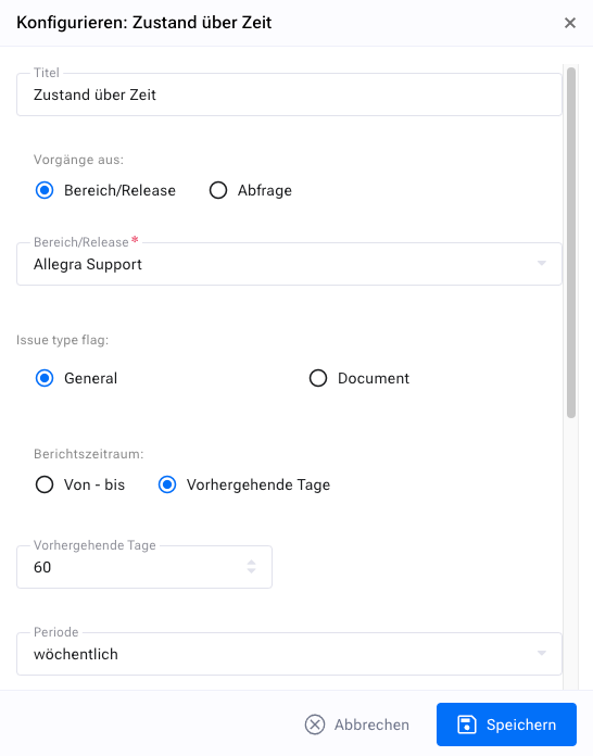
You have a number of display options. First, you should give your widget a meaningful name so that you later know what you are actually looking at in the widget.
Next, you need to specify the projects or releases you want to monitor. You can select an entire project, which covers all of its releases, or just a few releases.
Then choose the reporting period you want to monitor. You can either define a fixed interval that starts and ends on a specific date or, which is probably more useful, simply look at the last X days.
Next, you need to set the granularity of your widget, for example to daily, weekly or monthly. The granularity determines the time interval used to calculate the associated values. If the granularity is “weekly”, a reporting interval runs from the beginning of a week to its end.
In the next step, you need to select the type of algorithm you want to use to calculate the values to be displayed. Four different algorithms are available:
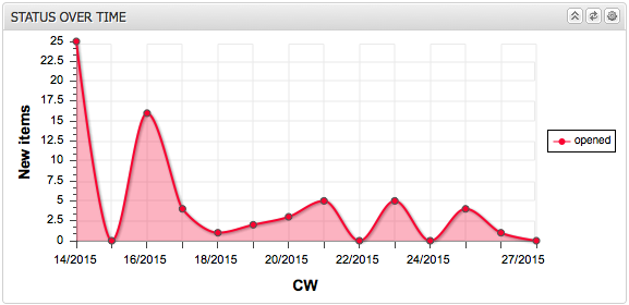
New items in interval: This chart shows the number of newly created items per reporting interval (day, week, month).
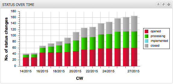
Accumulated activity: This chart shows the accumulated number of items that changed to the selected status in each selected interval. For example, if the granularity is set to “monthly” and the status to “implemented”, the chart would show for each month how many items changed to the “implemented” status in that month and in all months before it, back to the beginning of the reporting period.
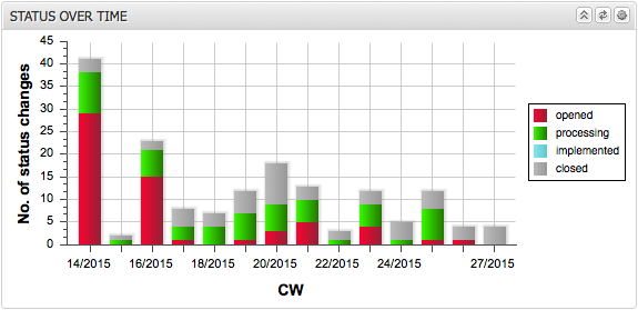
Interval activity: This chart shows the number of items that changed to the selected status within the selected interval. For example, if the reporting interval is set to “monthly” and the status to “implemented”, the chart would show for each month how many items changed to the “implemented” status.
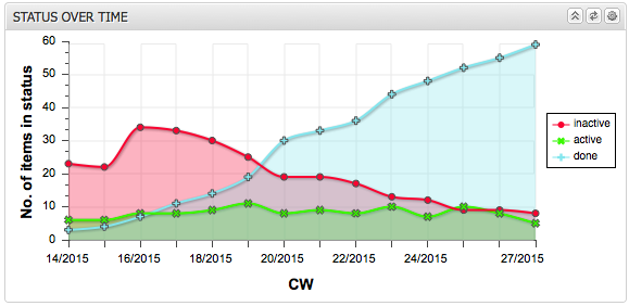
Number of items in interval: This chart shows the number of items that are in the selected status at the end of each reporting interval (day, week, month). For example, if the reporting interval is set to “weekly” and the status to “closed”, the chart would show for the end of each week how many items were in the “closed” status at that point in time.
In the final step, you can also set the item statuses to be considered. In the case of “New items in interval”, the status is meaningless, since only the creation date is taken into account.
You can group statuses into categories and display only the categories. You can use either a stacked bar chart or a line chart. Optionally, you can fill the area below the lines.
The following figures show some example views.